
RED or BLACK????
.jpg)

August 24, 2010
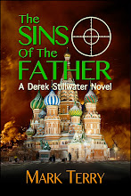
Although my publisher might kill me for posting these this early, here are two potential covers for next year's Derek Stillwater novel, THE VALLEY OF SHADOWS.
One had a black title. The other has a red & black title. Which would you vote for?
posted by Mark Terry at 10:35 AM
![]()
![]()

13 Comments:
Either works, although the red does stand out a bit more. (Hugs)Indigo
I vote for red. It draws the eye into the picture and the buildings in the picture are fairly dark. The red will pull more readers into the cover. Suck 'em in!
I keep going back and forth. Oh, all right, the red. No wait! The black. On second thought . . .
How about this? Go with the red, but have dark shadows within the letters, maybe the outlines of mountains rising up from the base. (I know how much publishers like it when authors give them "suggestions" about covers.)
Stephen,
You and I have the same problem, I think. Which sort of makes me think... flip a coin.
I like the black, but the red brings out the cover more.
Well, black is sorta like a perfectly polished performance that is perfect and wonderful but also slightly forgettable. The red, to me, stands out much more, but feels a little imbalanced. I'd go with the red. I might try turning "A Novel" red to see if it would bring unity to the cover, but that might not work. Either way, I'd definitely go with the red. I would not walk by the red cover without picking it up.
Natasha,
Interesting. That describes my feeling about it pretty well. It's like, well, the black looks more integrated and professional, but the red sort of grabs you by the throat. It doesn't quite look right to me, but it gets my attention faster.
I like the black better especially for a thriller. The red does catch my eye, but I'm more inclined to pick up the cover that invokes the thriller genre for me and that means black.
Boy, was that rambling....I could have just used one world - black - and be done.
I definitely prefer the black. Red just doesn't say shadows to me. But I'm judging from an aesthetic point of view. I think you'd have to rely on what a marketing person would say.
RED! (Which is what I said when you sent it to me a while back.)
:-)
Maybe the mist could have just a hint of red to it? The red is perfect, but it does seem to come out of nowhere...
Red, 100% for me.
It pops.
Post a Comment
<< Home