Cover Evolution


October 23, 2009
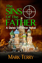
I showed you the cover art for my upcoming novel, The Fallen, a few weeks ago. A couple of you have seen the original cover art version because I asked your opinions of it. What I didn't show anybody was the version in between.
For those of you who don't know, the novel is called The Fallen, and it features my returning hero, Derek Stillwater, a troubleshooter for the Department of Homeland Security. He is an expert in biological and chemical terrorism and warfare. In the first Stillwater novel, The Devil's Pitchfork, Derek encounters a homegrown, yet international terrorist organization calling itself The Fallen Angels, and its leader calls himself The Fallen. Although that novel, to my mind, ends satisfactorily, The Fallen escapes. In The Fallen, obviously, I brought them back. Unfinished business, and all that. This novel takes place in Colorado Springs during the G8 Summit.
So when my publishing team and I had a conference call with the cover artist, the image of a bull's-eye was suggested, the image of an angel, mountains... we talked about a lot of things. MP5 submachine guns, mountains, ventilation shafts with bullet holes, all sorts of stuff.
The cover with the full-blown angel looking over his shoulder was the first cover we looked at. I admit, I liked this cover a lot. But something bothered me about it and I couldn't quite place my finger on it. So I showed it to a couple of friends and family members. It was Erica Orloff, She Who Must Be Read, who said something along the lines of, "it looks like a paranormal novel."
Uh-oh. I think she was right. And that worried me. A lot. Partially because, one of the things I noticed with my two previous Derek Stillwater novels, The Devil's Pitchfork and The Serpent's Kiss, was that readers, merely on the basis of the titles, often made the assumption they were horror novels of some supernatural sort. Furthermore, the covers, which I loved (different publisher, different artist), went for large symbols. The Devil's Pitchfork had, in red, a biohazard symbol that looked like it was carved out of stone over an image of the U.S. capitol building. It's a fantastic image (and to-date my favorite cover art, although the one for Catfish Guru was inspired; I pretty much still hate the cover art for Dirty Deeds), but I'm not sure it was completely clear that this was a vaguely military-esque thriller rather than a supernatural horror novel. (And Midnight Ink marketed it as a mystery, just to further confuse the issue).
The Serpent's Kiss, with its numerous deadlines and racing against time to prevent sarin gas attacks, had a green cover and a large image of a clock with a skull-and-crossed bones on it, superimposed over the skyline of Detroit. There were some gaseous-like things among the green. A terrific cover and I was reasonably certain it would be perceived as what it was, but the title could have gone several ways.
So as soon as She Who Must Be Read mentioned paranormal, I got jittery and told my publishers so. My agent's comment also was, "It's fine but get rid of the angel." I don't know all of their behind-the-scenes discussions, but they apparently agreed with me.
The cover artist's second attempt had a smaller angel on it. I just plain hated this cover. Very short discussion, but I basically told them I didn't like it and would rather have the first version than this one. I gather nobody particularly liked this cover.
The final version I'm quite pleased with. If I were to be in the bookstore and be picking up books entirely based on the cover, I think the first one would attract my attention. But I don't think it actually represents the book very well. The final cover, with its image of the Rocky Mountains, a sniper, and the bull's-eye superimposed over a U.S. flag is dramatic enough, clearly is representative of the book, and is eye-catching. I think it's a pretty good cover, ought to sell some books, and won't confuse the readers.
Thoughts?
Cheers,
Mark


3 Comments:
Definitely the rifle one. I thought the angel was too effeminate.
Love the sniper! :-)
I vote for the sniper one. I've read both the Derek books and I think this one fits much better.
Erica is right, the others look paranormal and I'd expect there to be angels in it.
Post a Comment
<< Home